The Context:
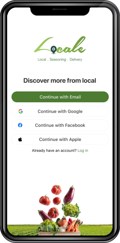
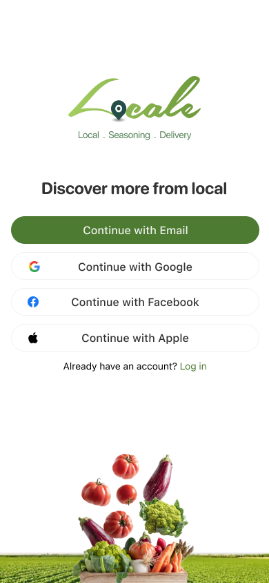
I'm developing a signup process for Locale, a platform connecting local farms with people in the community seeking farm products.
My Role:
UX / UI
The Objective:
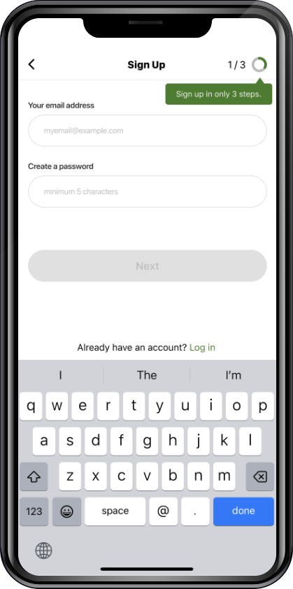
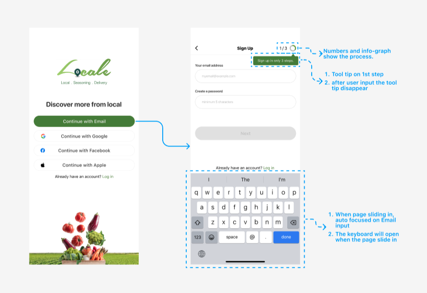
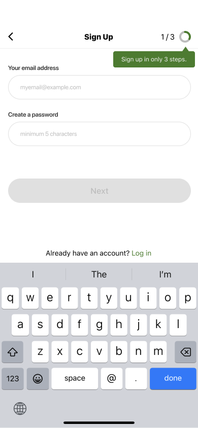
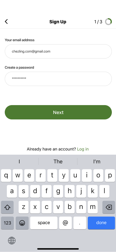
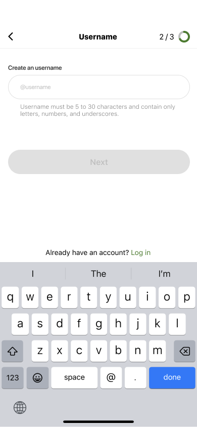
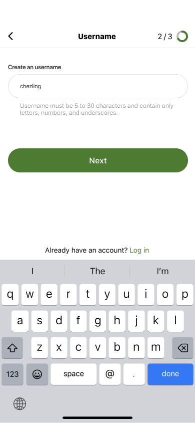
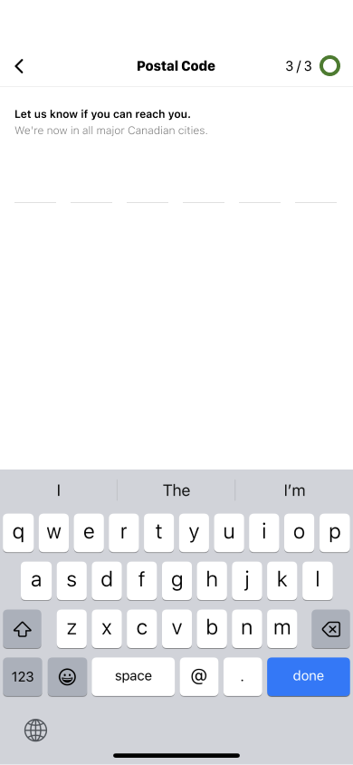
Design a seamless signup experience that fulfills both user expectations and the platform's requirements on Locale.
1. COMMUNICATIONS
2. RESEARCH
3. DESIGN
1. COMMUNICATIONS
2
3
Meetings with Product Manager:
· What information App wants to obtain?
· What messages want the user to receive?
· Any requirement from the regular sign-up process?
1
2. RESEARCH
3
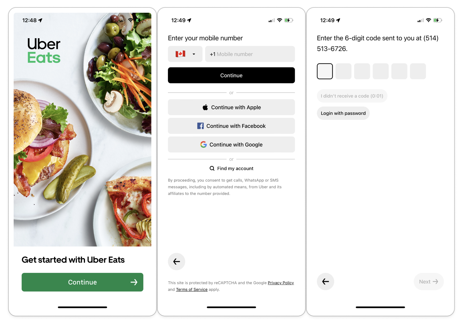
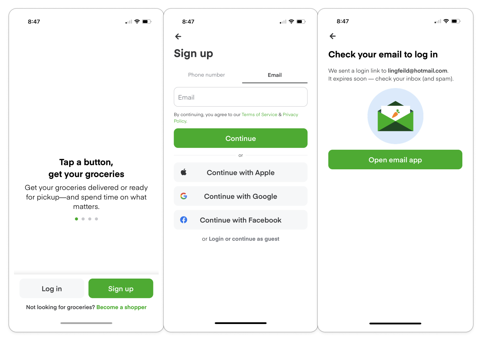
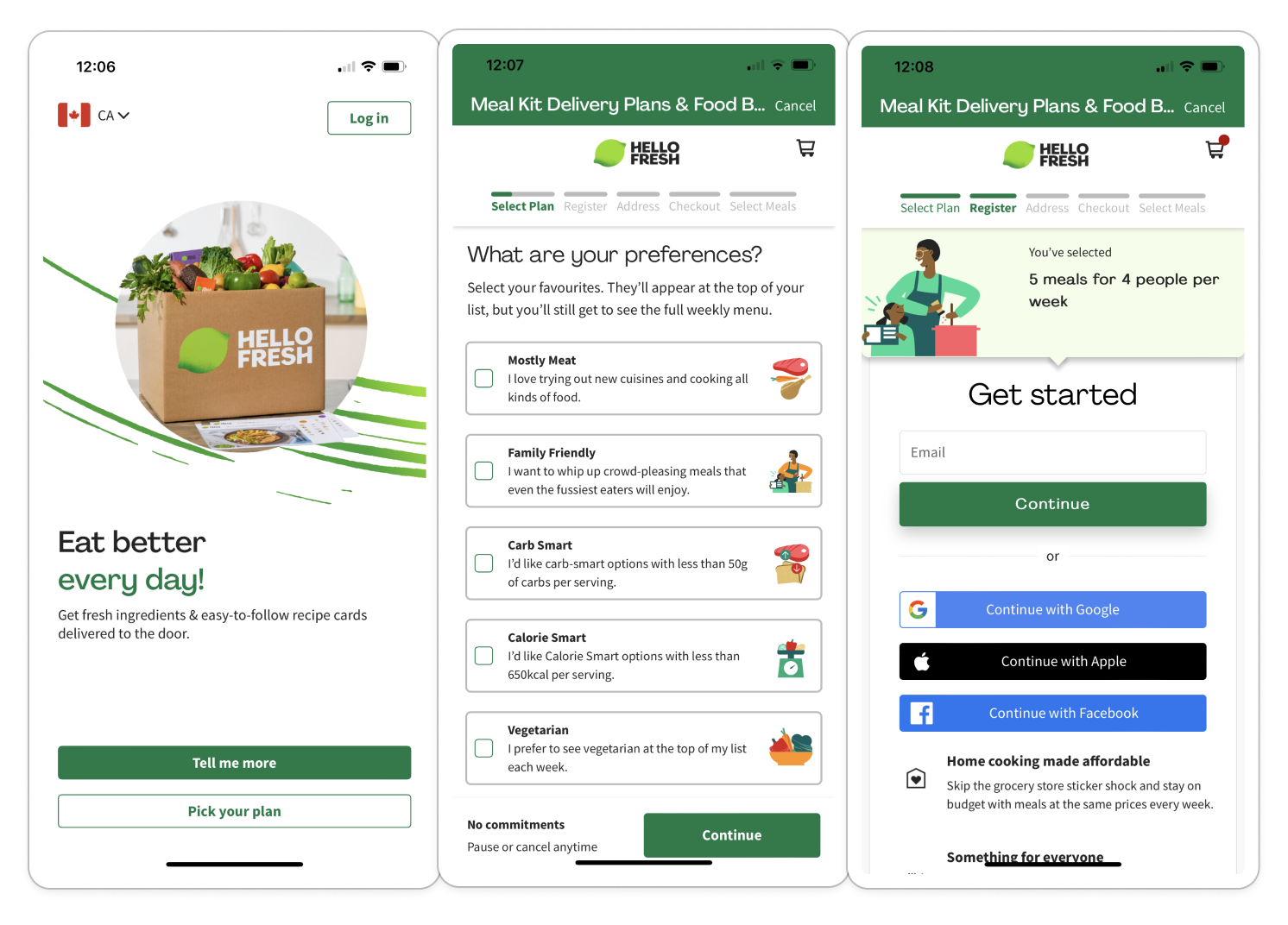
Competitive audit - competitors:
· Uber Eats - Most popular restuatants delivery app.
· Instacart - Grocery shopping and delivery.
· Hello Fresh - Meals' ingrdients delivery.
Competitive audit report:
Interesting takeaways:
· Simplicity needed for sign-up process.
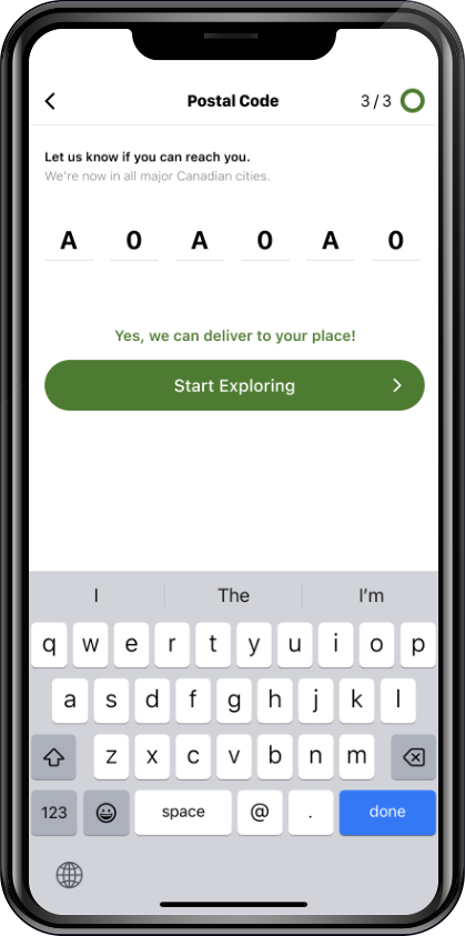
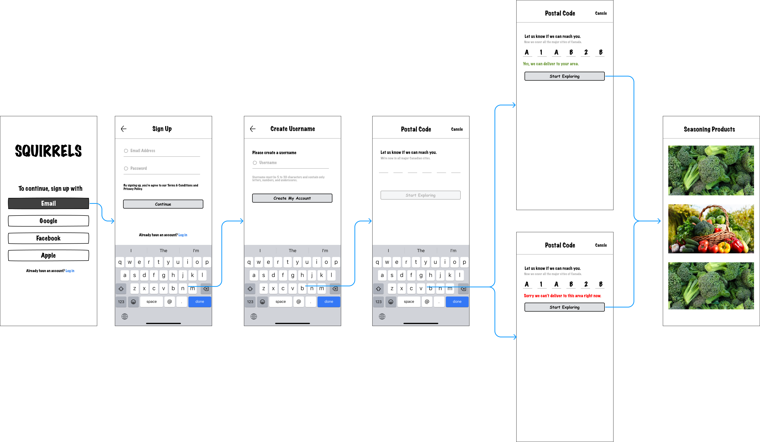
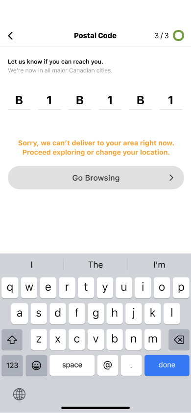
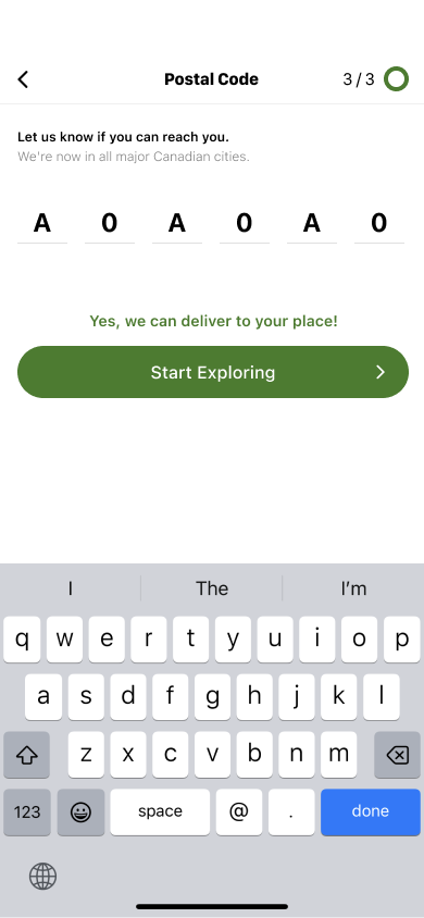
· Need to inform users whether they fall within the delivery area.
· Even if the user is outside the delivery range, forward them to browse.
1
2
3. DESIGN
